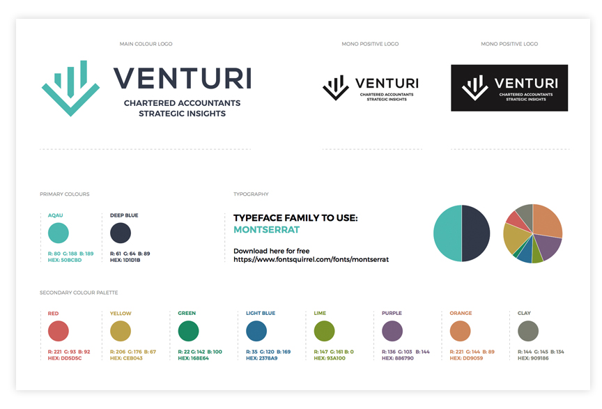
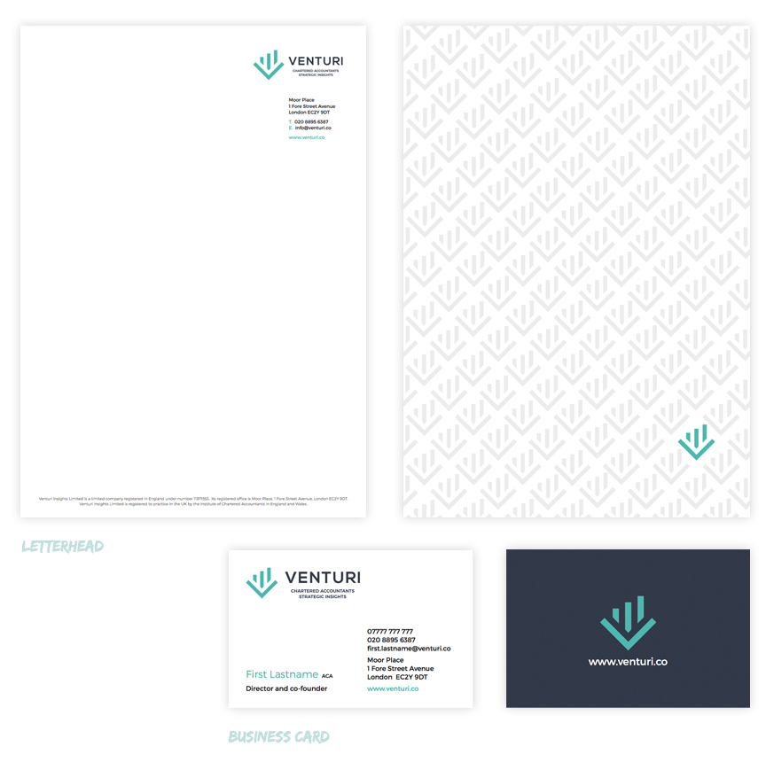
Stationery design for an existing client’s new business. We discussed the values of the business and the impression and ethos that they wanted to portray to their audience. The clean look to the front of the letterhead and continuation sheet was pared with a subtle logo mark pattern to the reverse with single highlighted mark. The business card has a contrasting solid background using the same main brand colour of deep blue with aqua logo mark. We also helped with graphics for the website and a brand colour palette guide for keeping a strong brand identity moving forward.


