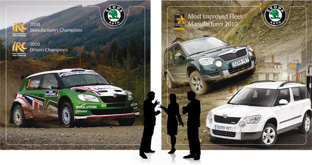
These Skoda UK stage graphics were produced for an awards evening to celebrate various Skoda awards for their cars. After the chosen concepts were finalised I set about creating the hi-res versions and incorporating the branding elements. Using Photoshop, I blended together three separate images to create the Yeti banner. At 3.7m x 4m in … Read More
Debbie Lord / Photography
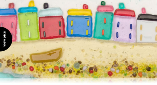
Debbie’s glass fusion pictures are full of bright colours depicting Cornish scenes. Because of the reflections caused by the glass, photographing them is a little more tricky. Using a light tent to house the pictures for shooting eliminated unwanted reflections from surrounding objects. Lighting came from top and sides for even colour. A bit of … Read More
Betty Boyns / Logo design
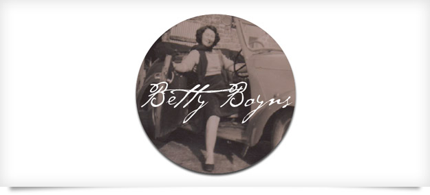
Betty Boyns specialises in vintage and retro inspired images, producing wrapping paper, fabrics and other homeware products. The logo brief was to have a vintage feel that reflected the name behind the business and for this I decided to use a photographic element. The image of Betty taken in the 40’s had such a great … Read More
ARLA / Logo
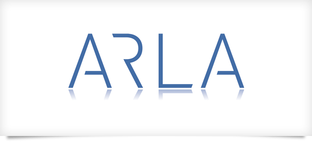
Logo design for kitchen and bathroom designers ARLA Design. The brief was very open apart from a modern clean feel. I used a font called DIN as the basis for the wording and then set about modifying it. I wanted the letters sit next to one another without any jarring angles. By cutting away the … Read More
Poppy Treffry / Poster Design
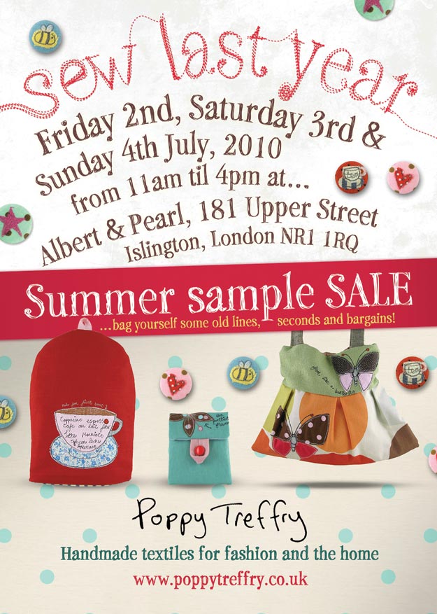
New A3 Sale poster to promote Poppy’s Summer sale in London. The handmade freestyle feel goes well with Poppy’s existing branding. I hand drew the ‘sew last year’ text by hand in Adobe illustrator using a wacom tablet and pen for smooth flowing lines. This would be harder to do with a mouse. The background … Read More
Sevens / Logo
I was asked to design a logo for a new rugby event being held in 2010. I wanted the logo to feel solid and chunky to reflect the nature of the game. I replaced the ‘v’ of seven with the character 7 which allowed me to cut across the rugby ball leaving a negative shape … Read More
St Ives Memory Bay / Logo
SIMB was a new project and Carta was asked to design and construct their website. In the process I also undertook the design of their logo. The project is based on people talking and recording their memories of the artist of St Ives. The speech icons in the logo are divided into three colours, each … Read More
Xpression / Logo
Xpression Event Solutions Ltd, came to Carta do design their corporate identity. They wanted an icon that was strong and bold and could work in a multitude of mediums. From livery branding to shirt embroidered logos. The square element depicts a box opening with each triangular flap forming an arrow pointing inwards to form an … Read More
Emma Ginnever / Photography
Photography for Emma Ginnever’s jewellery collection. Emma was looking for a natural relaxed atmosphere from the lifestyle photos. We used my home for the location shots as it’s quite muted in colour with all the vintage and Victorian features. The white background product shots were taken in the light-tent and lit from top and bottom … Read More
Justin Duance / Brochure
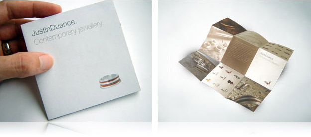
Justin asked for a brochure that would reflect his contemporary designs, be small and be different. The brochure folds out from a 10cm square to a 30cm square resulting in 18 pages of information. Production costs were kept to a minimum due to its unique folding. Printed in Penzance by Headland Printers.

